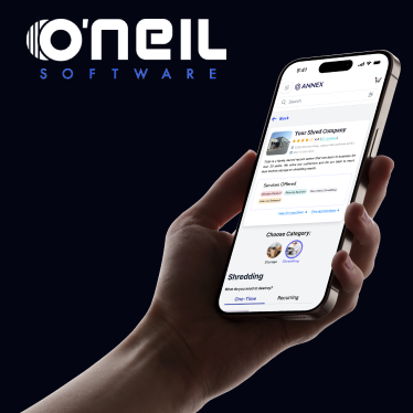
O'Neil Software is the leading provider of best-of-breed records and information management solutions for physical records centers worldwide, serving more than 1,000 locations in more than 100 countries.
My Role at O’Neil Software: UX Transformation Across Legacy & New Platforms AI Workflow Optimization.
The Challenge:
When I joined O’Neil Software, the challenge was clear: evolve a 20+ year-old legacy system while simultaneously designing a new e-commerce platform both with zero UX foundation in place. As the sole designer, I led efforts to introduce user-centered design to an engineering-driven culture, building trust, structure, and ultimately a fully operational design practice. From aligning skeptical stakeholders to delivering dev-ready prototypes, my work spanned research, system design, team education and leadership. Whether working within a React Native mobile stack or modernizing outdated workflows, my goal remained the same: make the product work better for users and the teams building it.
The first challenge? There was no design system, just scattered styles, competing flows, and multiple “graveyard” component libraries from years of turnover. With no existing UX infrastructure, I audited what remained, collaborated across departments, and identified the core components and flows we needed to prioritize for speed, consistency, and reusability. More than anything, this was a culture shift. Developers were used to owning the product experience. I had to earn their trust. So I did what I love: I ran a workshop. With devs, PMs, and leadership in the room, we prioritized what mattered most to everyone. That alignment became the foundation for our new design system and the launchpad for everything that followed. TL;DR: Brought UX to a 20-year-old engineering fortress, built a design system from chaos, and turned skeptics into allies. Backed by a solid design system for powerful, fast, AI prototyping.
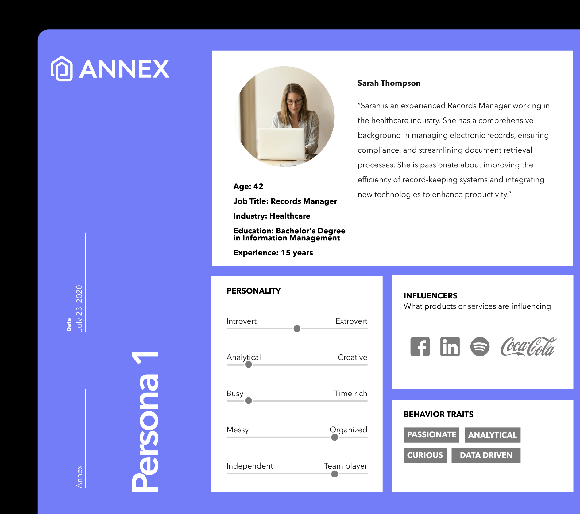
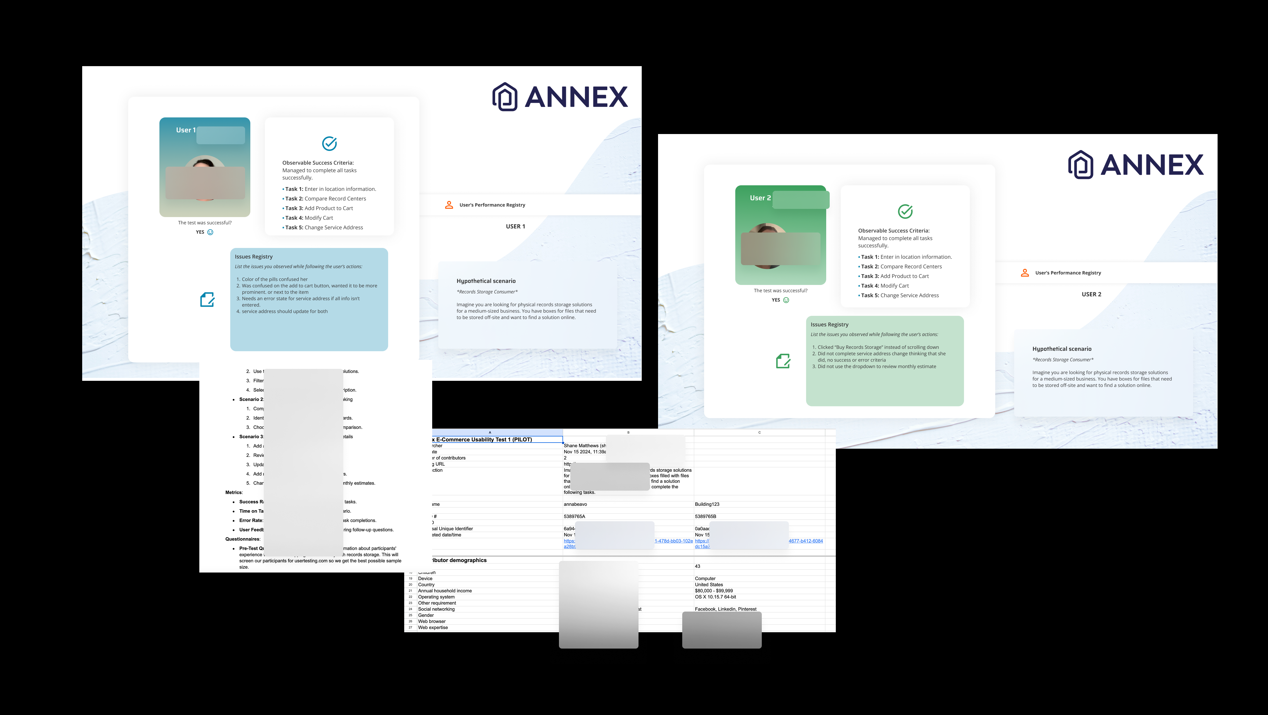
Performance Registries, Test Plans, and Data Galore! I love user research so much. From writing the test plans to executing moderated or unmoderated interviews. I organize my data into beautifully designed performance registry's and log my data into really boring spreadsheets.
I was a design team of one at O'Neil Software and had many things to handle so I used AI to optimize my user research alongside usertesting.com. When low on budget, and help, you have to get fast and lean but that is where my experience was a huge help. I knew I needed to get these scripts, test plans, and data together fast so we could get everything in the hands of the user as quickly as possible. Make no mistake this was an extremely robust piece of software that runs almost all records management warehouses in the world, there was no room for error. I had to be maticulous in my research and approach to how we would introduce this software to the user.
AI-Powered Prototyping Stack
AI-Powered Prototyping Stack
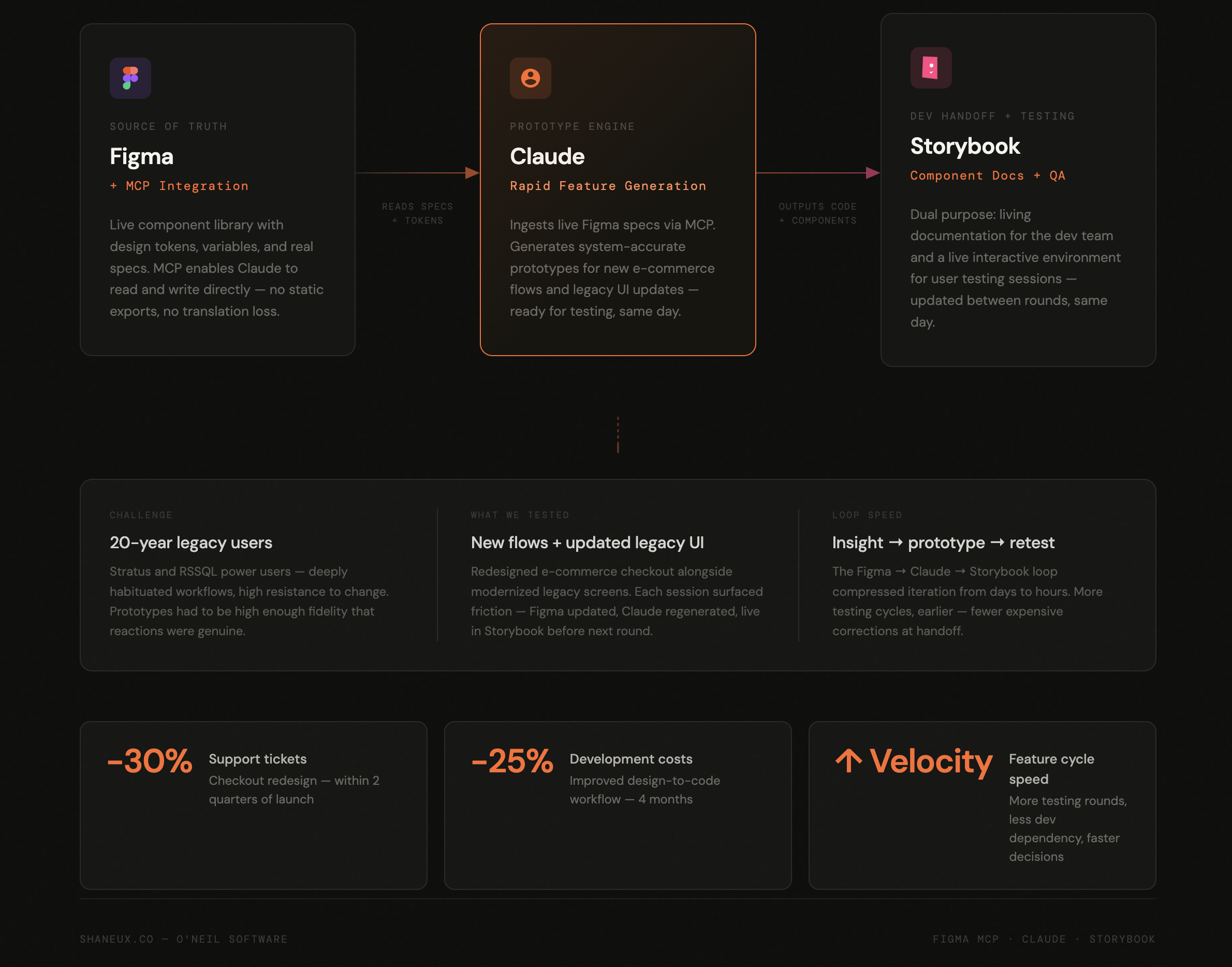
The Problem with Traditional Prototyping: Once the design system was established, we faced a new challenge: O'Neil's users weren't typical early adopters. Many had lived inside Stratus and RSSQL for 20+ years. Testing new flows — especially for the new e-commerce experience — couldn't wait for full development cycles. We needed a way to get real, working prototypes in front of real users fast, without pulling engineers off the product.
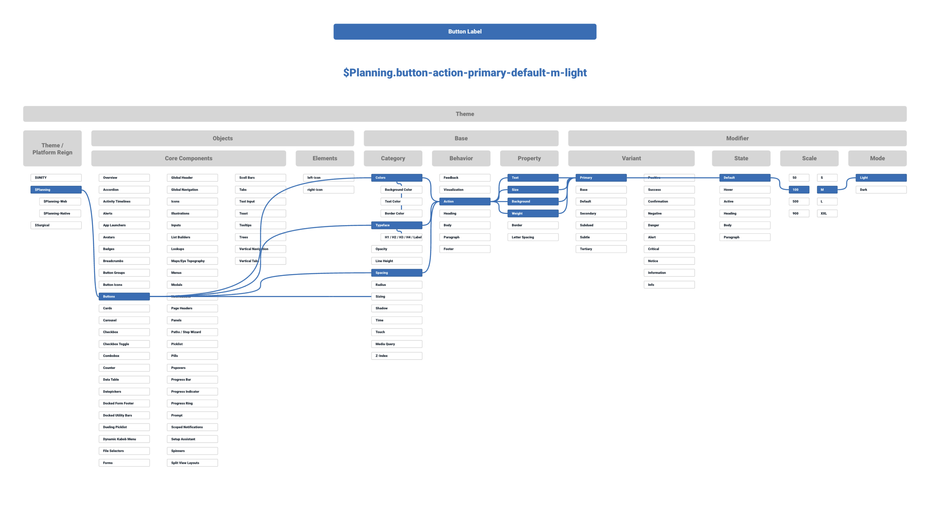
The Stack: I built a three-tool prototyping pipeline that connected Figma, Claude, and Storybook into a continuous loop.Using the Figma MCP integration, Claude could directly read and write to our component library — pulling real design tokens, live component specs, and layout structures rather than working from screenshots or static exports. This meant every prototype Claude generated was grounded in our actual design system, not a rough approximation of it.From there, Claude rapid-prototyped new feature flows — primarily the redesigned e-commerce checkout experience, and updated UI laid over legacy workflows that users already knew by muscle memory. Generated code fed directly into Storybook, where it served dual purpose: interactive component documentation for the dev team, and a live testing environment we could put in front of users the same day.
The Testing Challenge: Running usability tests on users with two decades of ingrained behavior required a different approach. We weren't just testing usability — we were measuring tolerance for change. Prototypes had to be high enough fidelity that reactions were genuine, but flexible enough to iterate between sessions. The Figma → Claude → Storybook loop made that possible. A session would surface friction, I'd update component specs in Figma, Claude would regenerate the affected flow, and it would be live in Storybook before the next test.
The Results: The redesigned e-commerce checkout flow reduced friction significantly, cutting support tickets by 30%+ within two quarters. Improved design-to-code workflows and cross-functional process alignment reduced development costs by 25% in four months. Faster iteration cycles meant more testing, earlier — which meant fewer expensive corrections downstream.
The Legacy Software
The Problem
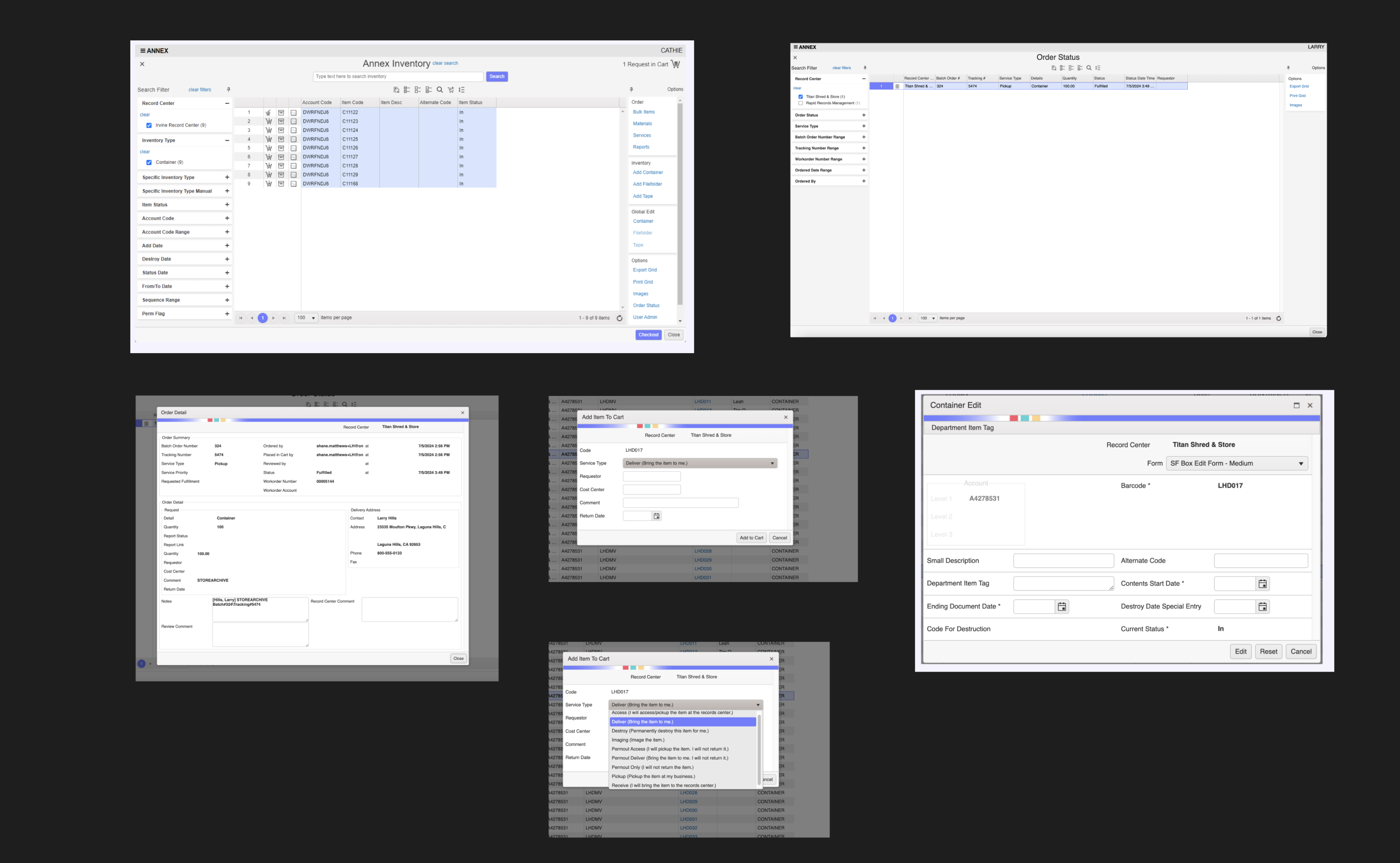
A detailed analysis of the legacy application revealed several high-severity UX roadblocks that caused massive friction and required extensive user training:
Buried Actions (Low Discoverability): As shown in the legacy screenshots, primary functions were hidden behind non-standard right-click context menus. For instance, adding a user or selecting a record row required an obscure right-click interaction. Forced Friction (Roach Motel Tendencies): The interface forced users to manually "pin" panels to keep them open. Without pinning, menus closed abruptly upon clicking elsewhere, trapping users in fragmented, unnatural task flows.
Cognitive Overload & Jargon: Navigation labels relied heavily on confusing internal terminology (e.g., distinguishing between "Web Order" and "Workorder") rather than natural human language.
Accessibility Gaps: The heavy reliance on mouse-driven right-clicks and drag-and-drop mechanics violated WCAG 2.1 standards, completely blocking keyboard-only and screen reader users.
The Redesign
The Solution
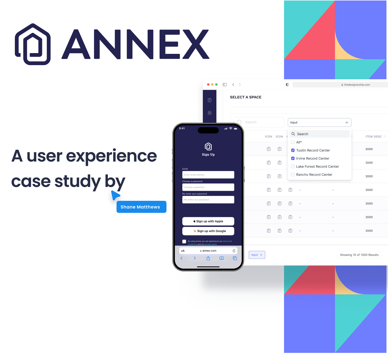
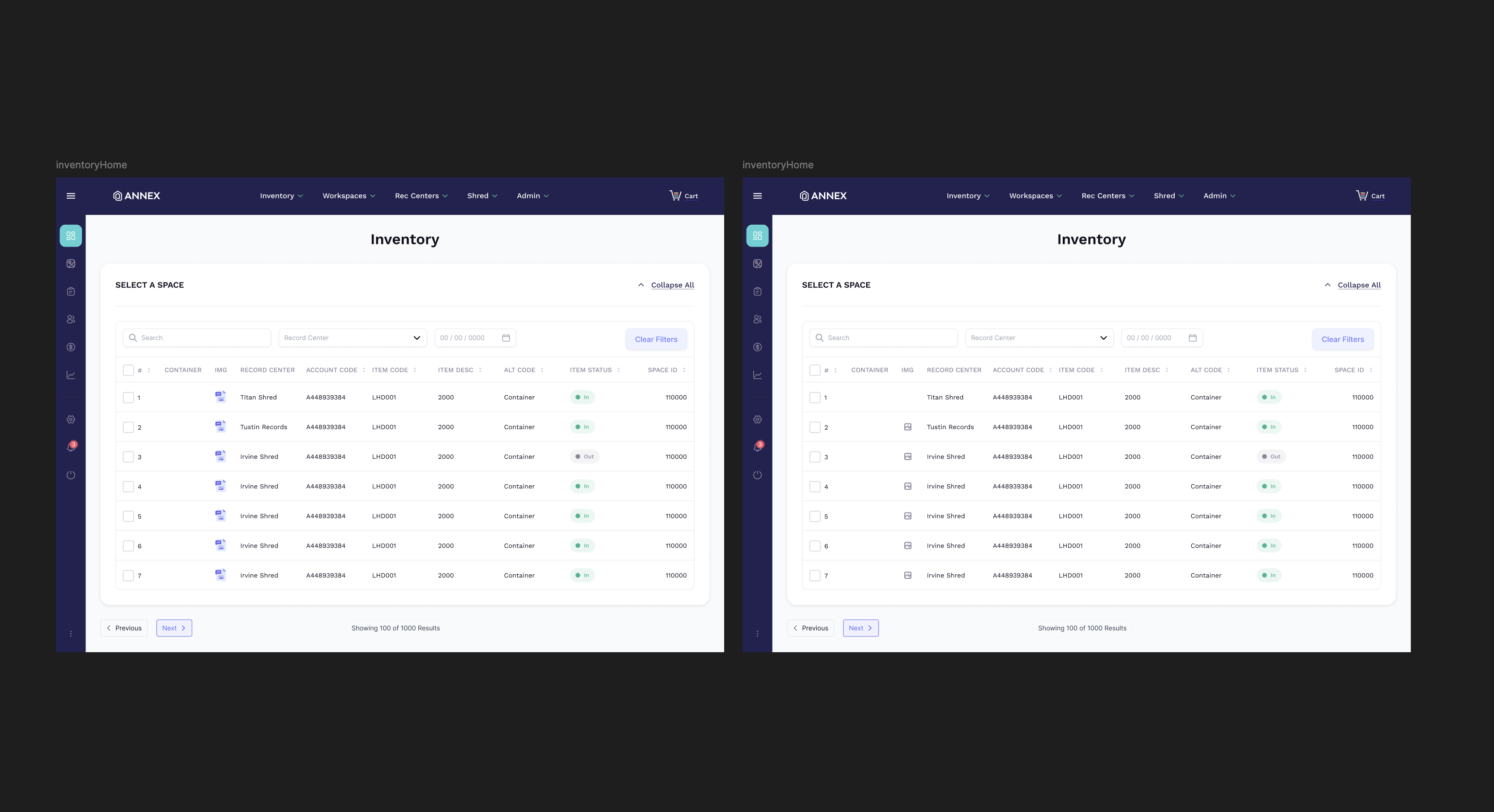
The redesigned interface, captured in the screenshots above, shifts the software from a system-centered layout to a completely user-centered experience.
1. Surfacing Hidden Actions (Nielsen Heuristic #6: Recognition Rather Than Recall)I stripped away hidden context menus. As seen in the side-by-side view in the screenshot above, the Annex Platform brings primary actions right to the surface with explicit, beautifully spaced interactive elements.
2. Eliminating Forced Pinning (Nielsen Heuristic #3: User Control & Freedom)The awkward "pinning" mechanic was entirely removed. Filters, global search bars, and side navigation menus are now either persistent or dynamically fluid, flowing naturally with the user’s gaze and intent.
3. Streamlined Forms & Inline Feedback (WCAG 3.3.1 Compliance)Instead of forcing users to click small warning icons to figure out data entry mistakes, the Annex Platform utilizes real-time, inline validation. Errors are cleanly stated directly beneath the affected form field, sharply reducing form abandonment.4. Human-Centered Language (Nielsen Heuristic #2: Match Between System & Real World)Confusing legacy terms were replaced with universal concepts. For example, the ambiguous checkout choices were consolidated into a modern, standardized e-commerce cart workflow which then fed the e-commerce application I was then to build next.
Summary: The Annex Platform redesign successfully mitigates user cognitive blockages, drastically drops support dependencies, and creates a highly competitive, human-centered enterprise web experience which also reduced their number one pain point and user complaint. Onboarding and Training.
Naked Development
Industry: Technology
Platform: Native Mobile, Web, Tablet, Smartwatch, AI
Role: Design Systems Lead
Naked Development is an application development agency that doesn’t just build tech, but helps build companies. Ranging from SaaS to medical tech, you never know what is going to come through the door. Shipping applications as quickly as possible to build a true MVP and let the users decide what features should be built next.
Design System Build
The Challenge:
As with most Design System projects the challenge was to first figure out what type of system we needed that could benefit all of the teams involved in our process. It is hard to boil down just one challenge here, but for the purposes of this portfolio and as to not have 67 pages written on just one project we will say the first and most important was to build a library of our most common components and flows that our designers and developers deal with daily. Create speed, consistency, and reusability. With high turn-over of designers I believe there were about 4-6 Design System "graveyards" I needed to audit first. I came to the conclusion after the audits that we needed to build a new system from the ground up.
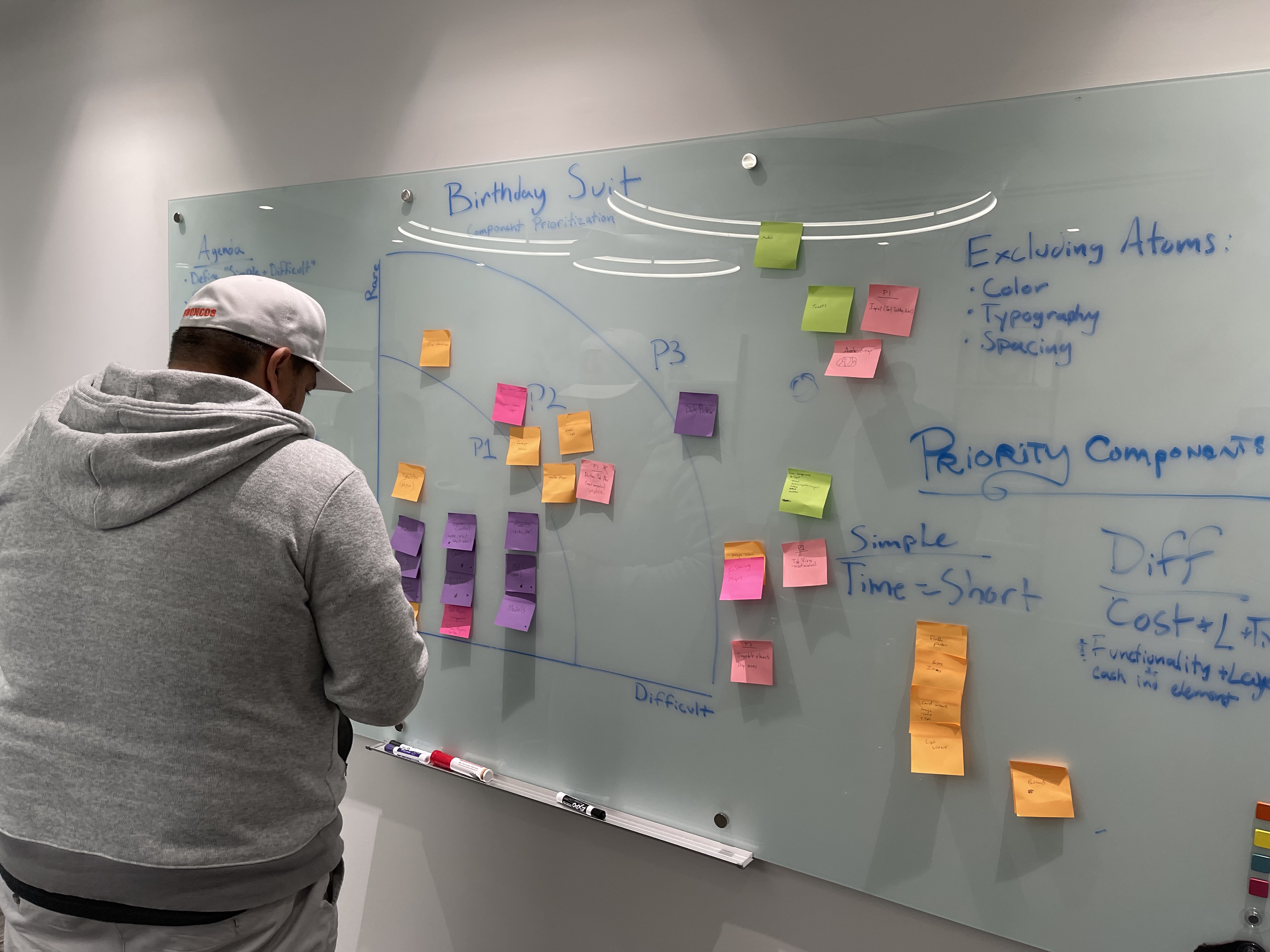
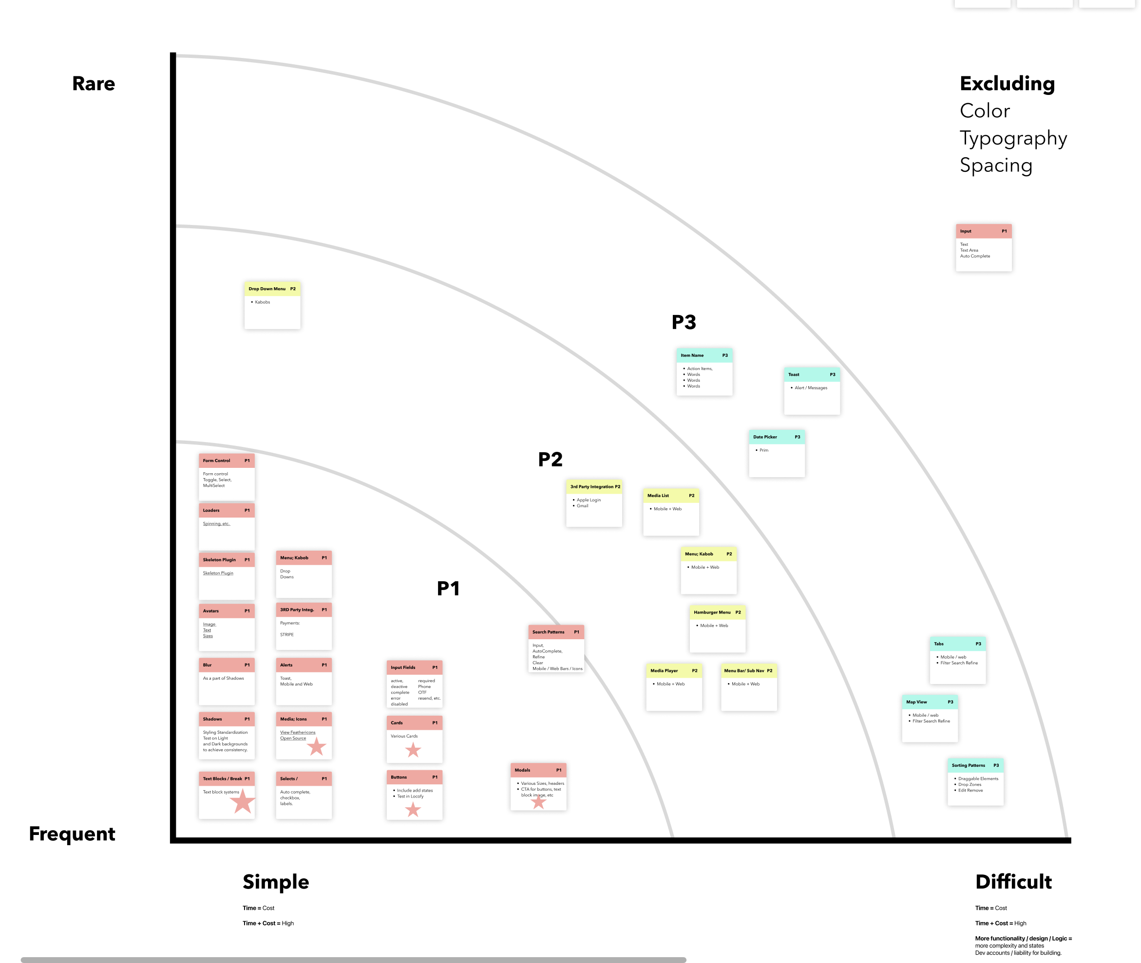
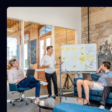
So it was time to dive in. First things first, grab your post-it notes it’s time for a WORKSHOP! One of my favorite things to conduct. Get all of our developers into a room and let's prioritize what should be built first. As the component prioritization workshop began I had noticed a common theme. Everything that our Dev's had prioritized was essentially in alignment with what our designers needed on a daily basis. Our first proof of alignment between these teams. Ah, the beauty. Now we can start on some teamwork and collaboration moving forward in which every team member would learn something about the constraints of both teams. Empathize, Ideate, Educate. We all needed to be on the same page throughout this process and it is my job to make sure that everyone is in alignment, and having fun while we do it.
TL;DR: Step one: discover six failed design systems. Step two: lock everyone in a workshop with no chance of escape. Step three: finally build one that sticks, build and train the design team.
Workshop Results
From the results of the workshop I now had a solid start for my road map. What components to build first and in which phase. Now it is time to check those graveyards to see if we can find any components to reuse or recycle.
Audit Time
As previously mentioned I knew I needed to build this Design System from the ground up. Even knowing that there still might be some useful stuff in our graveyards. We had about 4-6 libraries attached to one file called "client design systm" (that is not a typo it was spelled wrong) that was a scattered sticker sheet mess of unusable components... But wait... There is something shiny under all that dust!
While digging through the file a noticed a common pattern. The designers previous to me had multiple different options on multiple different pages of the same component and major flows. And guess what. It aligned with our data from the workshop with our devs. So, let's start building.
These are important to me as a front-end developer, and used to be what I dreaded as a designer. We need to make sure we are backing our design decisions, that they are concrete and well thought out. We also want to bring solid power and speed to development if we won't be developing this out ourself. Enter design tokens. Also enter Figma Variables. We will use token studio to handle both. But first, planning.
The Repo
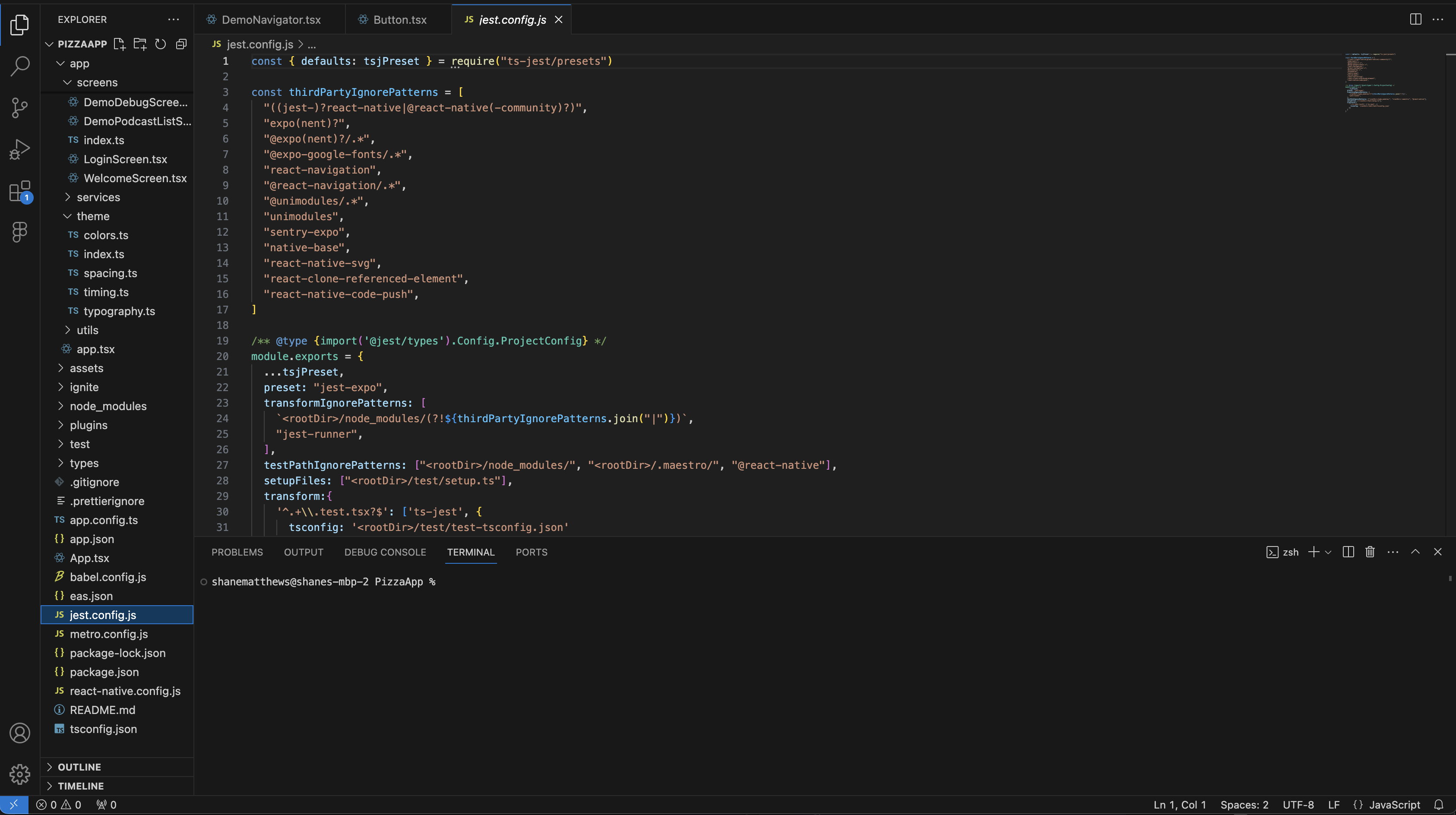
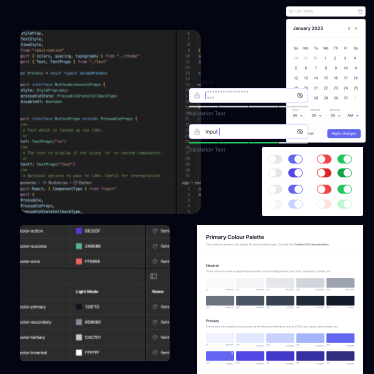
I can't show the actual code for this project, below is just a demo app that I use to practice building React Native apps. Anyway, at this point I would start to set up my repository for the design system. Depending on what language. For this project it was written in React Native. Using that and Typescript with a few things added on to the file for more complex components like Babel and Emotion it was time to get to work.
The Results So Far
After building the entire component library, design tokens, and documentation, a little thing called ChatGPT came out of nowhere. That gave me an idea though. Could we create a tool using Figma’s Rest API and AI to read our designs/components and spit out usable React Native code that is ready to go? Yes we can, with a lot of testing, research, trial and error. We are doing just that. I will not go into the details of the traversal structure or how we are exactly developing it on this web page because the project is ongoing, but I would love to talk to you about it! The design system is doing well, adoption is high as is the efficiency of our designers and developers. Operational efficiency is up 43%, adoption is at 81.5%, and our design to development conversion is at an all time high of 78%. This is also in-part to some sales training we conducted with our designers to best sell the design and move them into development.
Leadership
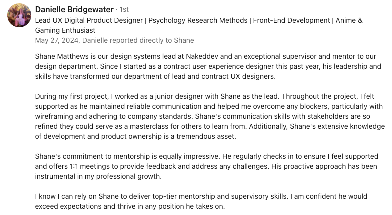
During my time leading design, I built more than systems, I built great designers. I established monthly skills workshops that gave designers space to sharpen their craft and grow beyond their roles. I created onboarding paths that brought new hires into the design culture quickly, ensuring they were confident contributors from day one. I trained teams, interviewed candidates, and guided the strategic direction of our product design efforts, making sure every voice was heard while keeping the vision clear. I championed adoption of the design system across teams, working closely with developers and product owners to align workflows and remove friction. By pairing hands-on mentoring with clear strategy, I was able to raise the bar for both the craft and the culture of design within the company giving my designers a safe and fun place to express themselves. Here is a blurb from one of my amazing designers.
Lee & Associates
Industry: Commercial Real Estate Platform: Web Application
Role: Lead Designer
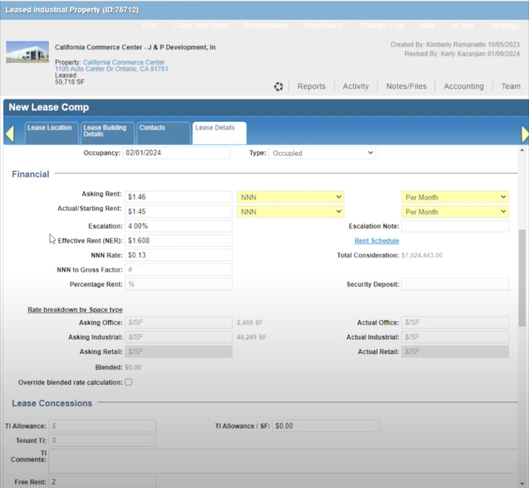
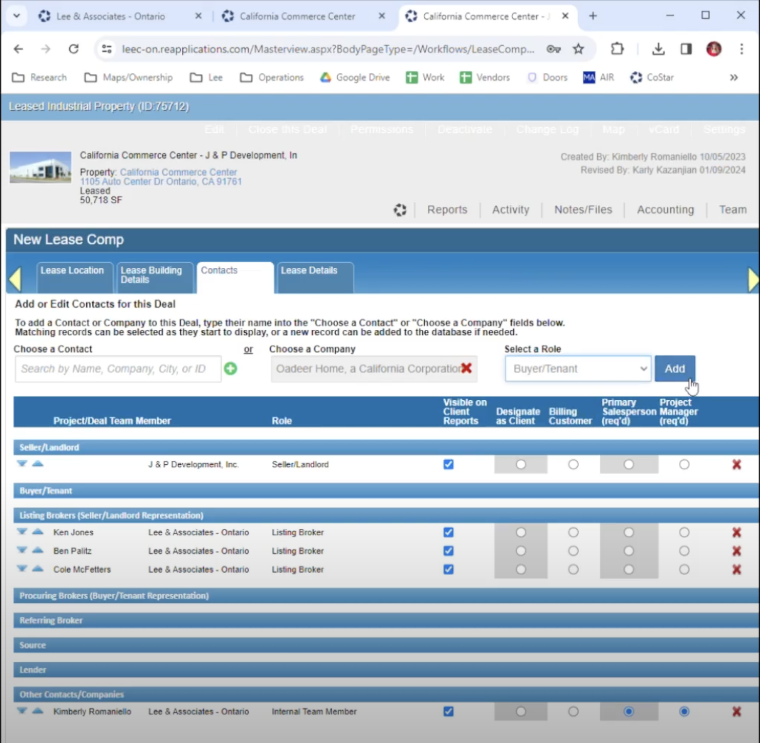
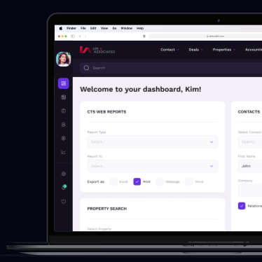
Lee & Associates is a leading commercial real estate company who relies heavily on their database of information to do their job. My role was to redesign their current environment which was being sunsetted, and to help lead the data migration and set up the backend structure with Development.
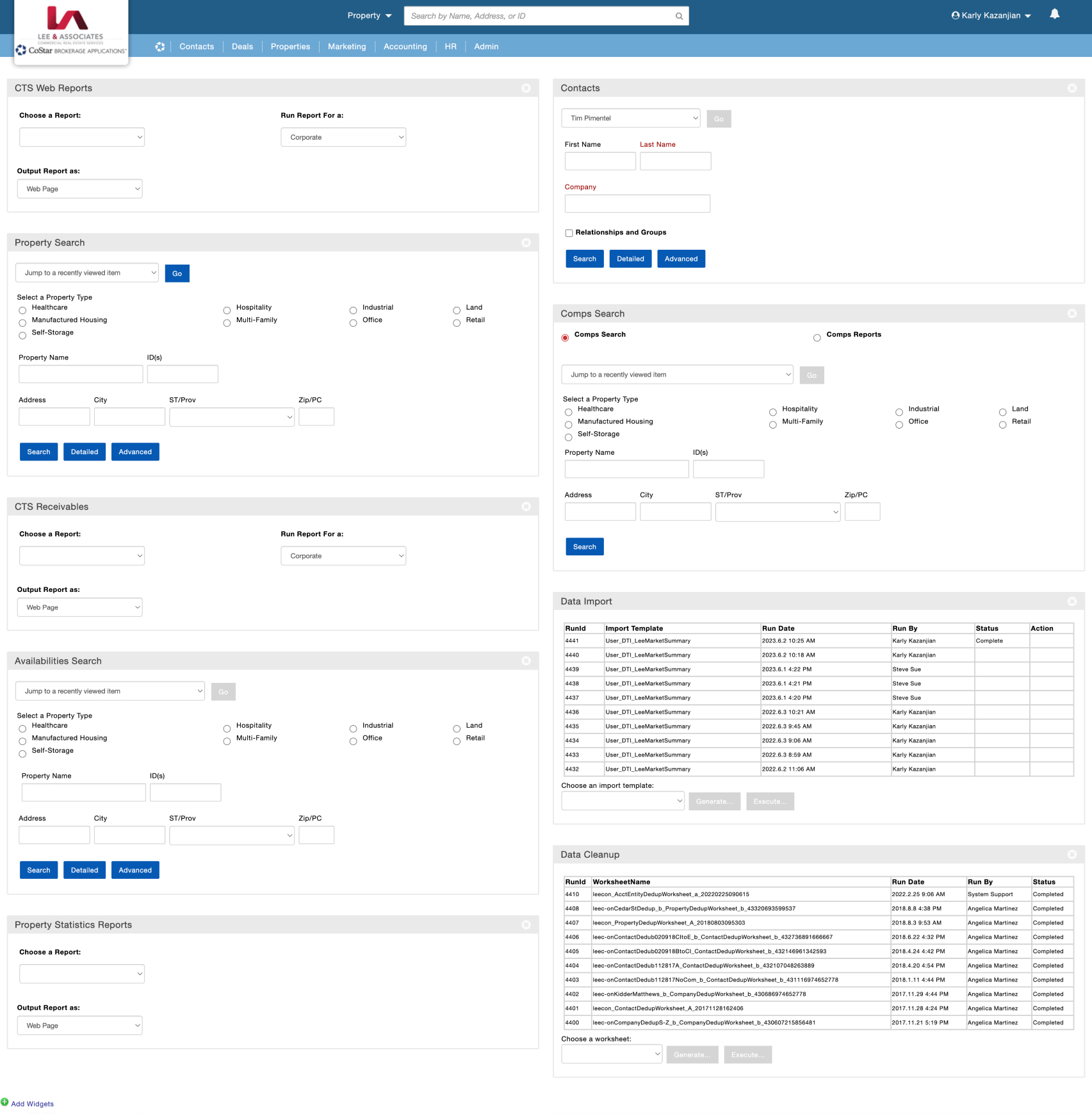
The Before...
We absolutely hate this archaic product. Please help us... Please. -The Client
This was a tough one. Migrate commercial real estate data that dates back to the 90's and design a front end experience in record time. Why in record time? The tool they use every day to accomplish their job is being sunsetted. We had 10 weeks to design and 6 months to figure out backend logic. I would like to thank the energy drink industry at this time, for helping me through an insane experience.
Challenge 2:
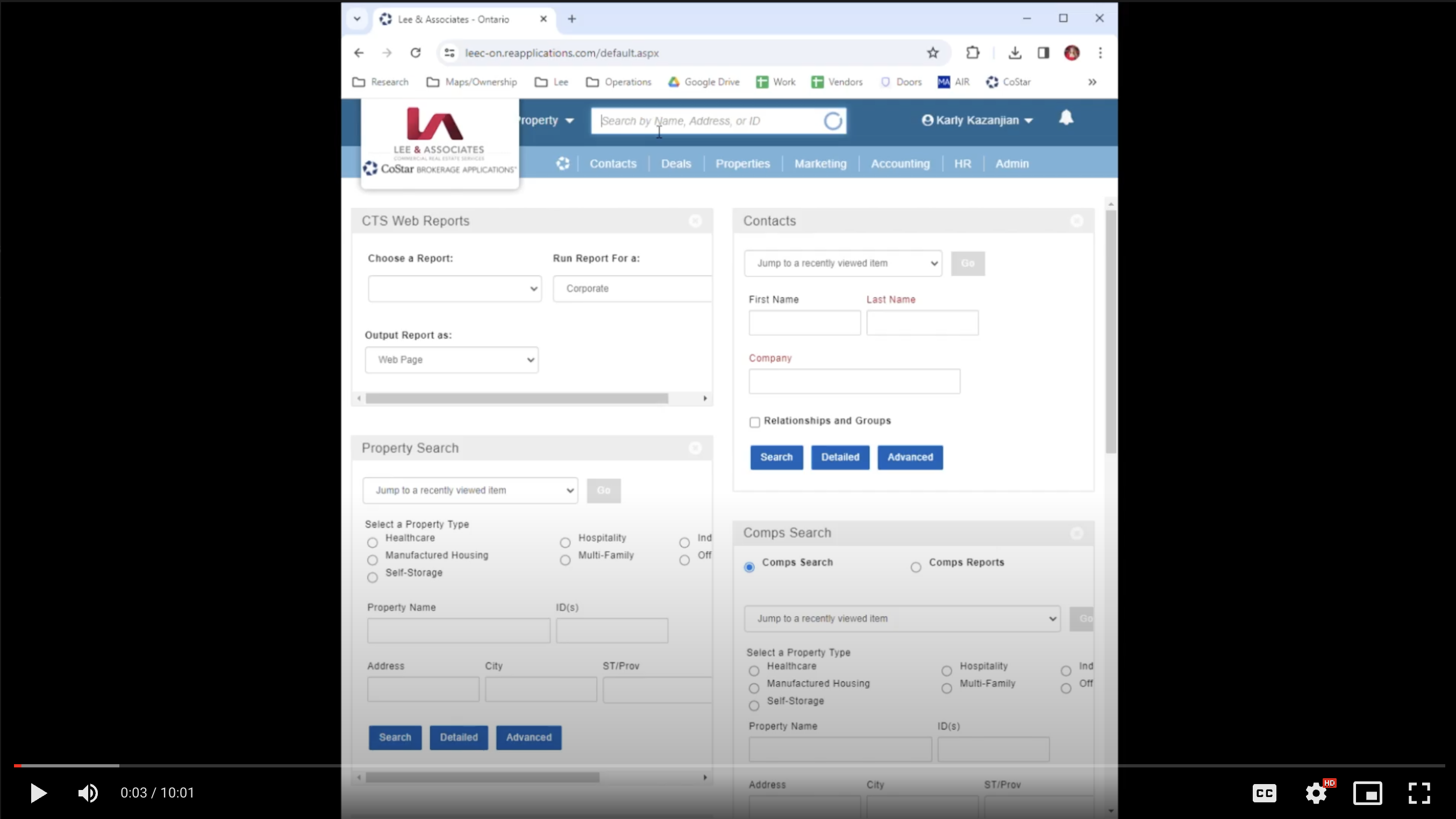
We needed to conduct usability tests on a team using the current product for work every single day. Field testing while not interrupting their day to day was tough. Some days we were able to set up a dedicated hour with certain team members so we could conduct our research properly, and other days we had to just observe and try and spot pain points without any direction. We also had to learn a whole ton about commercial real estate terms and jargon and become quickly acquainted with the industry.
Challenge 3: Cognitive Load. The client could not trust in their team to accomplish certain tasks because there were SO many details or single points of failure that could cause catastrophic issues. No safeguards in place to avoid them either. Also the task in mention had about 23 steps about half of which were unnecessary. Also about half of what the client had showed us in our initial meeting they never used.
Usability Test
There were about 28 steps to complete the main flow that we were testing. We reduces those to 5.
Hardly any of their documents were digital and they were constantly fighting against themselves and their clients by having to print, fill-out, and sign critical documents. The clients were not filling out pertinent information either, just what was important to them. We created a digital version with required fields that also deprecated the entire need of a 10 minute task that they had to execute multiple times per day.
Below is a screen shot of a moderated usability study I ran. We conducted about 4 moderated and 2 unmoderated studies. After we completed this we synthesized all of the data and began to implement some solutions.
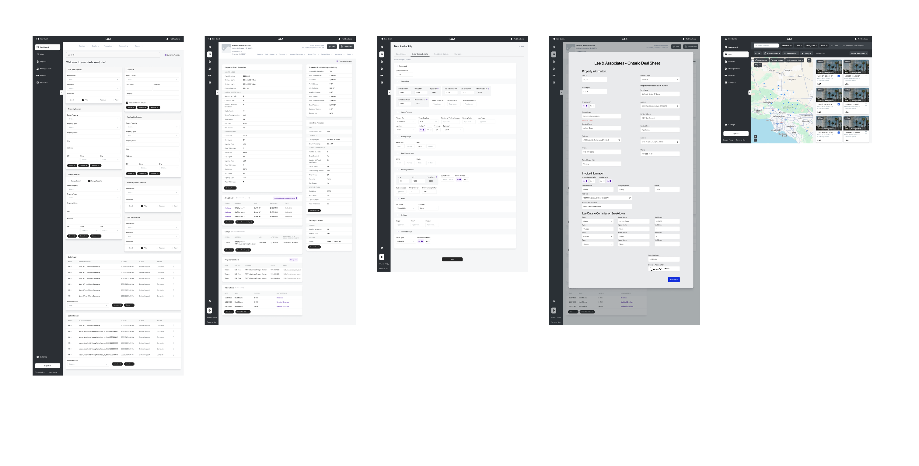
Wireframes
After we ran a usability test on their current tool we started to synthesize that data to design solutions in mid-fidelity wireframes. Resulting in a much more usable product that is set to improve efficiency by upwards of 78%
Time For a UI Overhaul
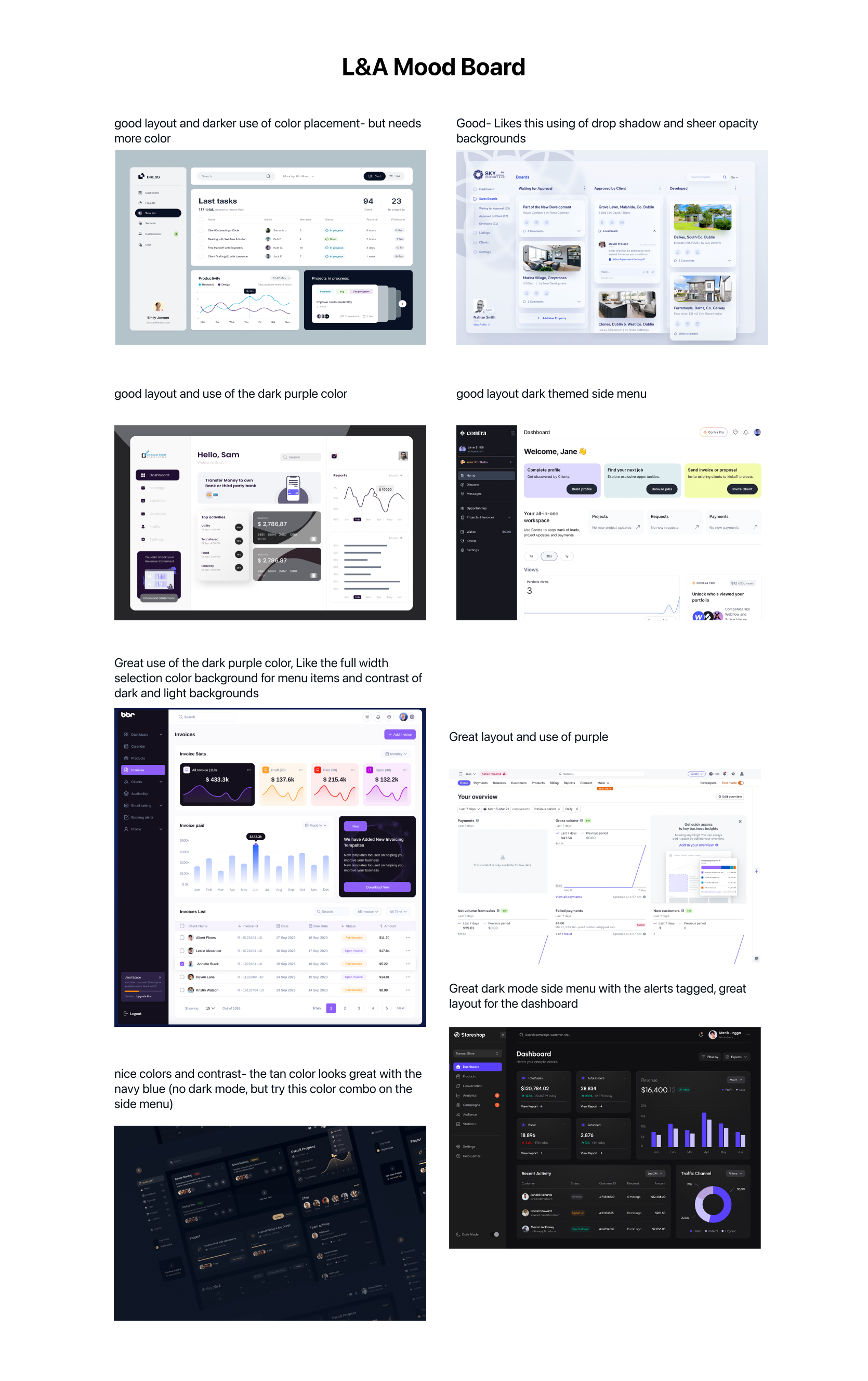
We started with a client meeting where we presented a mood-board. We let them guide this portion of the product. “Tell us what you love and we will bring it to life.” This is the result from a much larger mood board with notes on their choices about what they liked. During this exercise I make sure to dig deep and ask the client very specific questions like, "Do you like a CTA with rounded edges?", "Do you like this color palette?" amongst many other questions to best set up hi-fi UI success.
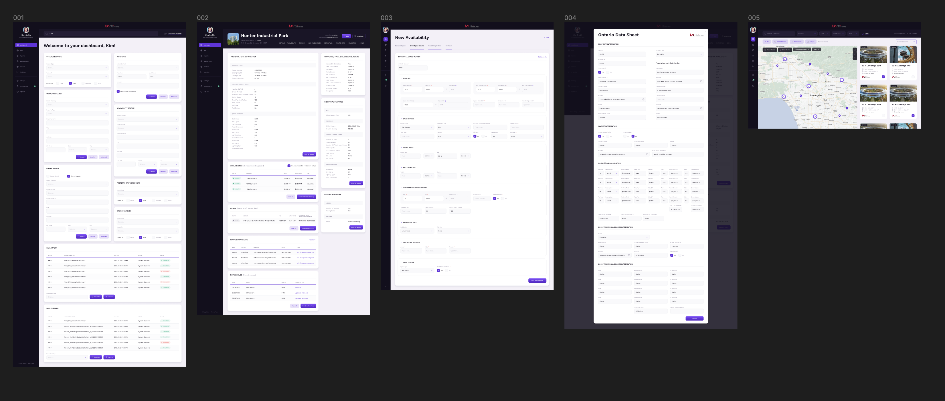
The After
The results so far...
The Client was very happy with the results and it is now time to move to the handoff process. Currently we are setting up our dev environment and prepping for the data migration. We cloned their current environment so we can run some user tests on their current workflow and new workflows to measure the success of the product but allowing all new and relevant data to be updated to both environments.
Orcasound is a cooperative network of underwater hydrophones across the Salish Sea, listening for endangered Southern Resident killer whales. I designed a real-time bioacoustic dashboard that turns detections into action — surfacing live whale calls, confirming them with community listeners, and triggering vessel slowdowns before the pod moves on. A mission-control interface for marine conservation.
Case study · Volunteer engagement · Orcasound.net
Designing a mission-control dashboard for whales
A real-time bioacoustic monitoring interface that turns a hydrophone network into an intervention tool -- detecting orca calls, verifying them with human listeners, and triggering vessel slowdowns before the pod moves on.
Role
Design lead
Org
Orcasound (open source)
Scope
Research → UI → system
Deliverables
3 artifacts
01 The brief
A scientist's whiteboard and an analyst's audio editor
Orcasound runs a cooperative network of underwater microphones across the Salish Sea. The mission is concrete: locate Southern Resident killer whales by their calls, and redirect ship noise so vessels don't drive the pods away from the salmon they depend on. I came in to design the dashboard that makes that possible.
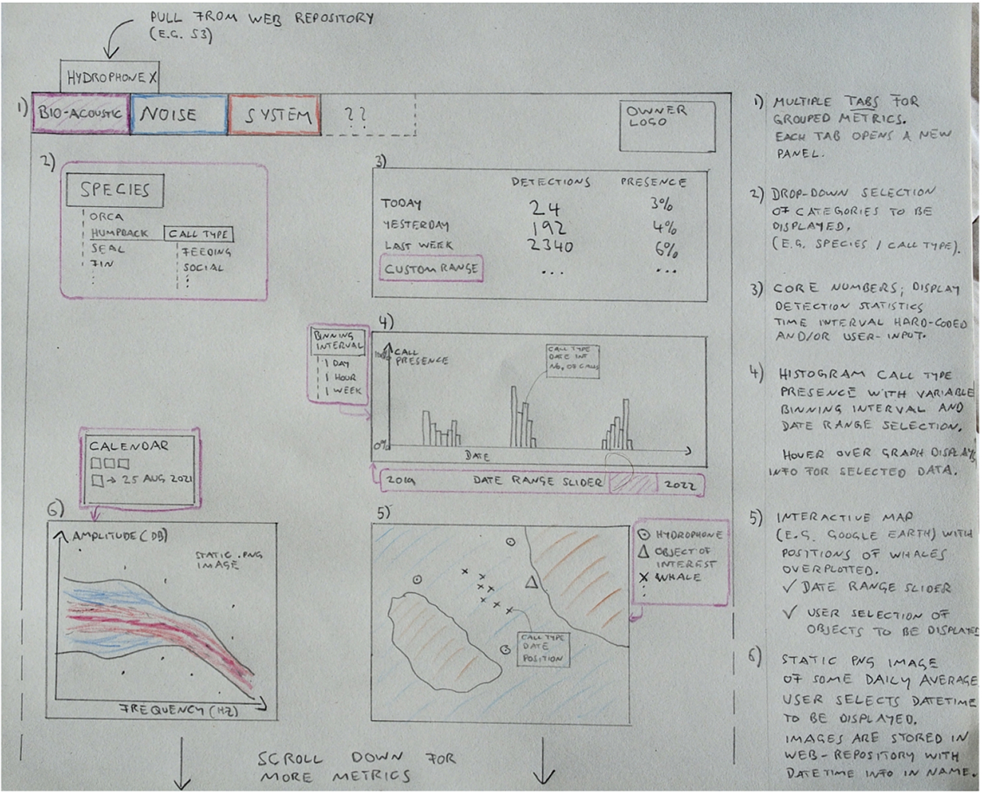
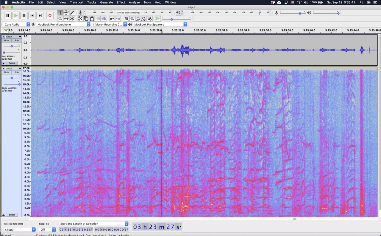
I had two primary inputs. The first was a hand-drawn concept from a domain scientist I interviewed -- six numbered panels specifying the data the team needs. The second was more revealing: a screenshot of how an analyst actually works today, scrubbing spectrograms in Audacity and reading call contours by eye.
Input A -- the scientist's sketch. Six panels: tabs, species dropdown, detection counts, presence histogram, interactive map, daily-average spectrum.
Input B -- the real workflow. The analyst trusts the spectrogram over any model output. This told me where the interface had to start.
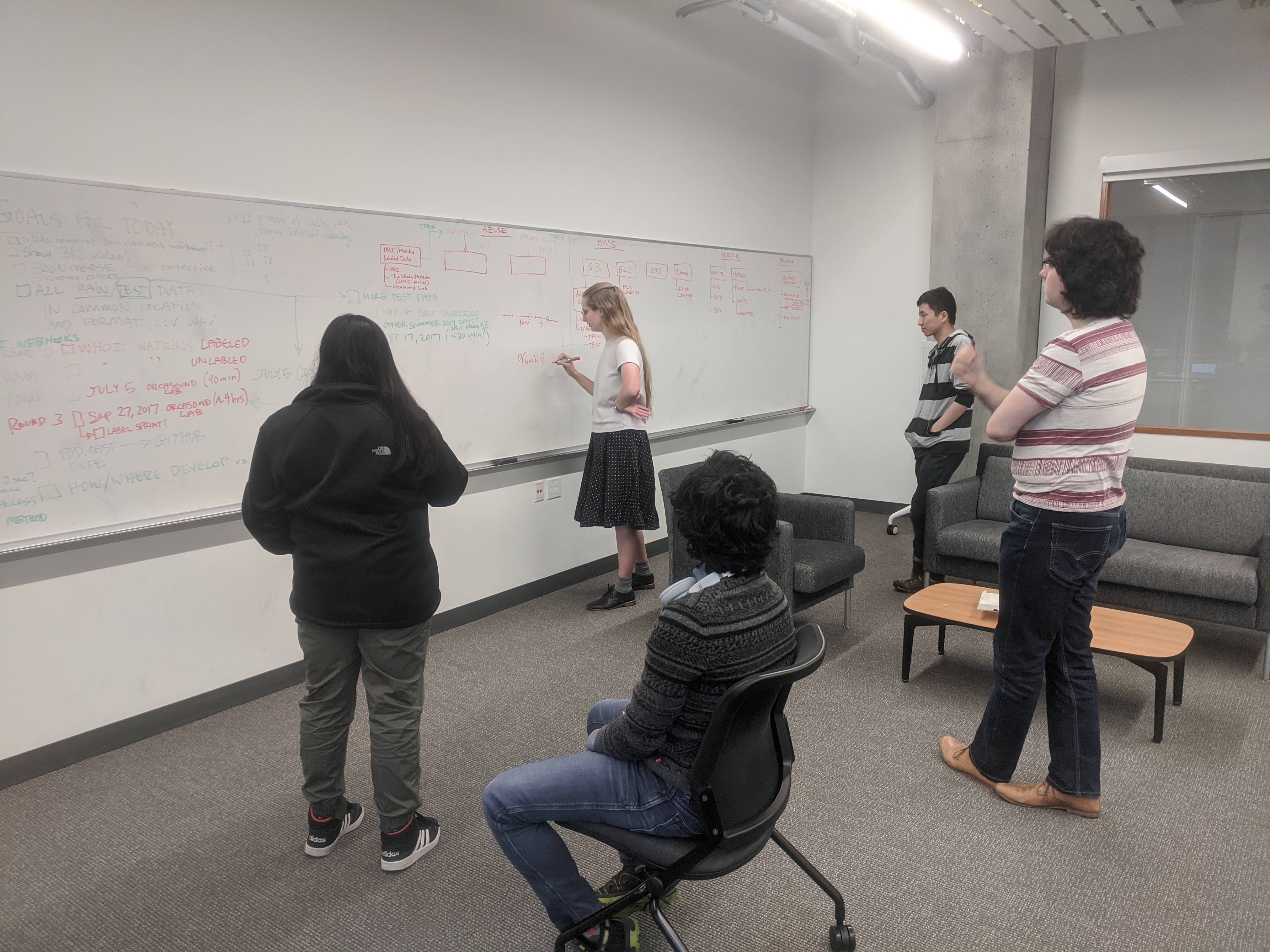
This was hands-on, cross-functional work -- I was part of an Orcasound hackathon team mapping the data pipeline, model, and infrastructure together in the same room. The whiteboard below is from one of those sessions: training and test data planning, the cloud architecture across Azure, AWS, and Heroku, and a P(whale | x) detection-probability sketch. Designing the dashboard meant understanding that system end to end, not just its surface.
The room. An Orcasound hackathon session -- data pipeline, detection model, and cloud architecture worked out collaboratively. The dashboard's model-confidence and S3-archive details trace directly back to decisions made here.
Core reframe
The sketch was organized for retrospective analysis -- counts, histograms, averages. But the mission is a real-time problem with a perishable window. If the pod is at the hydrophone now and a ship is inbound, that is the moment the dashboard exists for. So I restructured the entire hierarchy around time-criticality: now → recently → historically.
02 The design
Detect, verify, intervene -- in that order, top to bottom
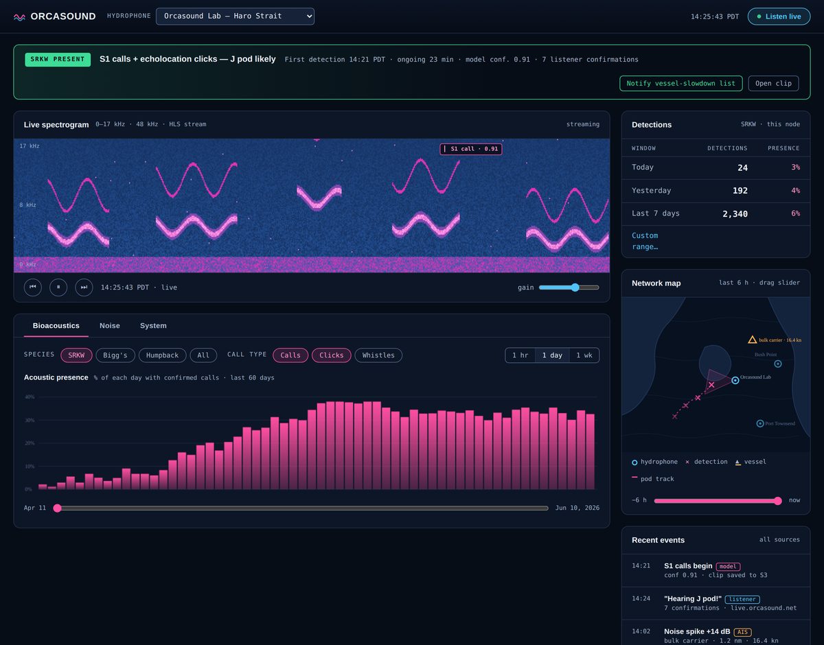
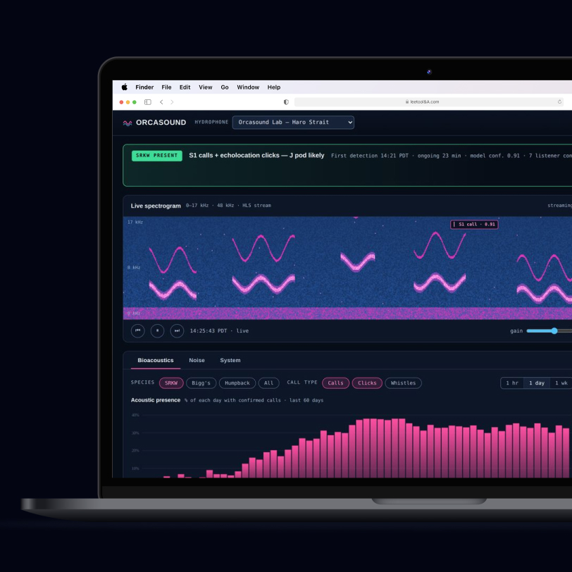
Every element earns its vertical position by how time-sensitive it is. A green presence banner with a "Notify vessel-slowdown list" action leads the page -- because a dashboard that only displays a detection is a science tool, while one that closes the loop to the intervention is an operational one.
The finished dashboard. Live spectrogram hero, presence banner with intervention action, network map with pod track and AIS vessel, detection stats, and a unified event feed. Interactive prototype linked below.
Why the spectrogram is the hero
The Audacity screenshot told me what to trust. Analysts and Orcasound's community listeners read spectrograms directly -- it's the ground-truth artifact. So instead of hiding audio behind a "listen" link, the scrolling spectrogram sits front and center with detection flags overlaid on it and a 30-second skip-back. The model proposes, the human confirms. That human-in-the-loop pattern is already how Orcasound operates, so I surfaced listener confirmations right alongside model confidence.
What I kept from the sketch, and what I pushed back on
When a domain expert hands you a sketch, the content requirements are usually right; the arrangement is where UX earns its keep. Six pins below map each sketch item to its home; four more mark additions I synthesized from the workflow and mission.
1
Grouped-metric tabs -- kept verbatimBioacoustics / Noise / System maps cleanly to three user questions: what's vocalizing, what's interfering, is the instrument healthy.
2
Species dropdown → visible filter chipsDropdowns hide state. A researcher should never open a menu to know what subset they're viewing.
5
Map -- kept, plus a bearing cone and AIS vesselThe sketch's legend stayed; I added direction-of-arrival from the detecting node and the ship plotted with speed, because the pod-to-vessel spatial relationship is the intervention story.
6
Daily-average spectrum -- given a baselineOne day's spectrum is meaningless alone. Plotted against a 30-day median, it answers the real question: is today noisier than normal?
A
Presence banner + intervention actionAdded. Leads the hierarchy and turns detection into a decision.
D
Noise-to-vessel correlationAdded. A spike without a cause isn't actionable; pairing it with the matching AIS track makes it a flaggable incident for partners like Quiet Sound.
The visual system isn't decoration
Dark UI is functional here: spectrograms are luminance-encoded data, and the blue-to-magenta colormap from the Audacity capture only reads correctly against near-black. I then promoted the data's own colors into the interface language -- magenta = biological signal, cyan = infrastructure, amber = anthropogenic noise, green = confirmed presence. That semantic consistency means the map, the feed, the charts, and the spectrogram all speak one color vocabulary, so a user can cross-reference panels without reading labels.
03 The audit
Holding a saturated data palette to WCAG AAA
A vivid spectrogram palette and a 7:1 text-contrast bar are in natural tension. Rather than wave it away, I audited every color pairing against its actual surface -- and against the lightest surface a token ever sits on, which is where dark themes quietly fail.
Token
Issue found
Resolution
Result
--ink-faint
2.84:1 on raised tiles -- failed even AA
Lifted to #9CB0CB
7.2:1 AAA
--ink-dim
6.19:1 on tiles -- failed AAA
Lifted to #A4B6CF
7.7:1 AAA
--call (text)
5.2:1 -- fine for bars, fails for small text
Split into a text token
7.5:1 AAA
control borders
1.4:1 hairlines on interactive elements
Added --edge for controls
3.1:1 (1.4.11)
The decision that became a system rule
Magenta now ships as two tokens: --call is pigment (bars, markers, strokes -- where 3:1 applies) and --call-text is ink (anything a person reads -- 7:1+). Same hue family, so the spectrogram identity survives. An audit finding turned into token architecture.
Note: the spectrogram and chart canvases are data visualizations, which contrast rules don't govern directly -- but the colormap has a continuous luminance ramp, so it survives the more important test, which is color-blind and grayscale legibility.
04 The system
Extracting a small, maintainable design system
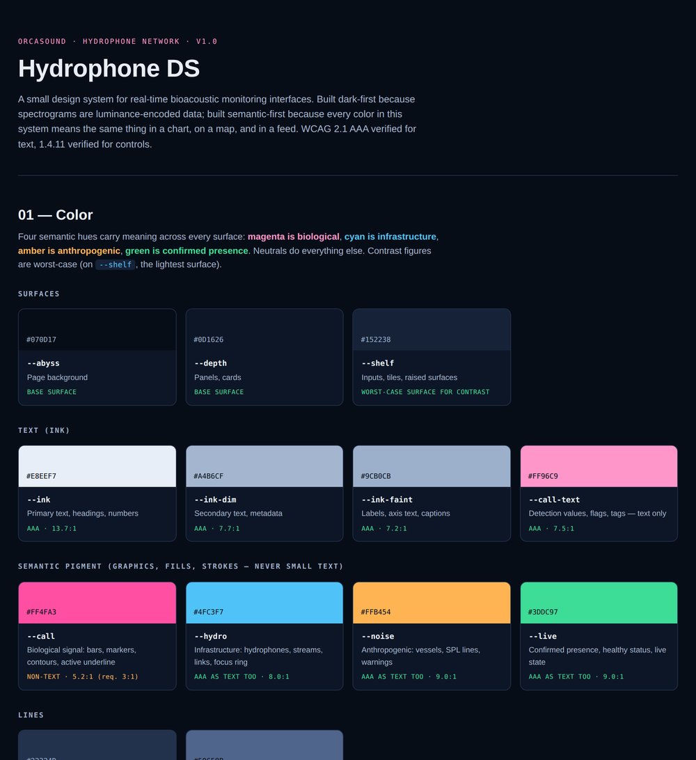
One screen isn't a system. I pulled the tokens, type scale, components, and rules into a self-documenting style guide -- every component is the live canonical build, so it doubles as a copy-paste reference for the next contributor.
Hydrophone DS v1.0. Color organized by meaning, every swatch labeled with its worst-case contrast ratio, and rules specific to this product. Full system linked below.
The rules are domain-specific, not generic: every detection must show its provenance (model / listener / AIS) and confidence, because partners make slowdown decisions off these signals; actions name their outcome ("Notify vessel-slowdown list," never "Trigger webhook"); and ARIA state attributes are the CSS styling hooks, so visual and assistive state can't drift apart.
Honest scoping
I deliberately held this at "small system" size -- tokens, type, shape, eight components, rules. No icon library or motion spec beyond reduced-motion. A volunteer-run open-source org needs a system its volunteers can maintain. That constraint was a design decision, not a shortcut.
05 Working with the devs
Tokens authored for the team’s real stack, not an idealized one
Before proposing anything, I checked what Orcasound actually runs. Their live app (orcasite) is Next.js + TypeScript; their current public “dashboard” is a set of Google Looker Studio embeds. So this interface is a net-new concept -- which meant the honest job wasn’t to match an existing token system, but to author one that lands cleanly in the stack their volunteer devs already use.
I delivered the design tokens as a Tailwind config -- the most readable, portable format for an open-source dev review -- with an inline createTheme mapping in case the team standardizes on MUI. Two decisions came directly out of anticipating the dev conversation:
✓
Spacing rides the framework defaultThe 4/8/12/16/20/24 scale is already Tailwind’s default p-1…p-6. Shipping custom spacing tokens would have been drift for its own sake, so I didn’t -- one less thing for a contributor to learn or break.
✓
The ink/pigment split survives the portMagenta ships as two tokens: call.DEFAULT for fills and strokes (3:1), call.text for anything read (7:1 AAA). MUI has no native concept for this, so I flagged it as the one rule that must survive a framework swap.
Sourcing note
Stack (Next.js/TypeScript) is verified from the public orcasite repo. The current Looker Studio dashboard is verified from orcasound.net. I did not assert a specific styling library for their dashboard because I couldn’t confirm it from source -- the Tailwind framing is my handoff choice, stated as such, not a claim about their codebase.
06 Outcome
From two reference images to a coherent, accessible, documented product
3
shippable artifacts: prototype, AAA audit, design system
AAA
WCAG 2.1 text contrast, verified worst-case on every token
1
color vocabulary shared across chart, map, feed, and spectrogram
The work reframed a reporting dashboard into an operational one, grounded the interface in the analyst's real workflow rather than an idealized sketch, and left behind a documented system the team can extend without a designer in the room.
Production caveat
The bearing cone and pod track assume multi-hydrophone triangulation or directional inference that the network may not yet run in production. In a real handoff these ship as roadmap-dependent features, clearly flagged -- not as claimed current capability.
Explore the live work
Host the three prototype files in Webflow and point these links at them.
BackTrack is a mobile and web application that helps reunite people with their lost items. If you find a lost item you can post that item on BackTrack and a user can go through the process of claiming it. If you are a business like a hotel, after a certain holding period you can post lost items to the Backtrack marketplace to sell.
When I started working on this product they were already in development for over a year. Originally I was tasked with QA as we did not have a QA department at the agency. I eventually built the QA department myself so that the agency could also scale as more products were moving to a support phase. What they asked of me after QA was to work on some new flows and features that they needed developed out. After accomplishing those, they saw the level of design I was able to execute and wanted a full audit of the Figma file as well as a design system to scale the product properly as sales were starting to pick up.
Problem Areas
The first issue I noticed after running through the Figma file was design turnover. Too many cooks in the kitchen. We also had developers go rogue on some features being built so they were not a 1:1 match. The developers did not have much of a choice because of that turnover and strict deadlines. Decisions needed to be made. The file was also extremely messy and confusing. Time for a single source of truth.
BallPlayer
Industry: Sports Platform: iOS & Android
Role: Lead Designer
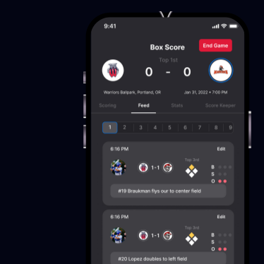
Ballplayer is a scorekeeping app designed to stay with you from the little leagues to the big leagues. Share your stats with your friends and family. Every hit, every catch, every walk, every stolen base. Ballplayer is the social app for ballplayers to share and compare LIVE stats during their game. Featuring in app messaging and LIVE activity feeds.

.svg)


.svg)